


Have you ever wondered how shapes are created using Css?...Do you marvel at the amazing projects on codepen made from combing different Css shapes? Have you ever wondered if the brains behind such projects are just mere developers, or code witches and sorcerers because you just can't figure out how they did it?..lol
Well, the truth is , no black magic or voodoo was used in those projects, if you know your way around certain Css properties, you can do the same too!
In this article, you will learn how to create basic css shapes by combing the width, height, left, right, top, bottom, border, and transform properties of Css. Pseudo-elements like :before and :after will also come in handy, so don't forget to run each code snippet on your code editor as you read along :)
Ok! before we proceed, I'll like you to set up your html code as seen below;
<!DOCTYPE html>
<html lang="en">
<head>
    <meta charset="UTF-8">
    <meta name="viewport" content="width=device-width, initial-scale=1.0">
    <title>Making Shapes in css</title>
    <link rel="stylesheet" href="./style.css">
</head>
<body>
    <div class="container">
        <div id="css-shape"></div>
    </div>
</body>
</html>
We will change the id name "css-shape" in both our html and css file to the name of our preferred shape (like square, circle, rectangle, e.t.c) to make things clearer as we progress.
So, your css should look something like the code below(feel free to mess around with the code according to your preferred taste)
.container {
    display: flex;
    justify-content: center;
    align-items: center;
    height: 100vh;
}
Have you done that yet?.. Oksssss... let's dive right in and create good looking shapes with css.
Creating squares and rectangles
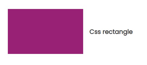
Squares and Rectangles are actually the easiest shape to create because by default a div is always a rectangle or a square. Specifying a height and width to your div element will automatically give you either a square or a rectangle, and you can spice things up by adding a background color as seen below.
#square {
    width: 150px;
    height: 150px;
    background-color: rgb(153, 33, 117);
}
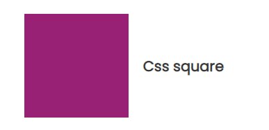
Notice how the square has exactly the same width and height, and how the width and height of the rectangle below differ.
#rectangle {
    width: 250px;
    height: 150px;
    background-color: rgb(153, 33, 117);
}
Creating Circles
Creating circles in Css is as easy as creating squares and rectangles. Circles can be created by adding a Css property called border-radius to your code. Adding a border-radius to elements gives it a curved border. Here's how to create a circle in css;
#circle {
    width: 150px;
    height: 150px;
    background-color: rgb(153, 33, 117);
    border-radius: 50%;
}
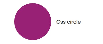
Tip: Setting the border-radius to 50% with the same width and height creates a perfect circle. However, setting a different width and height creates an oval shape.
Try creating an oval shape by yourself on your code editor :)
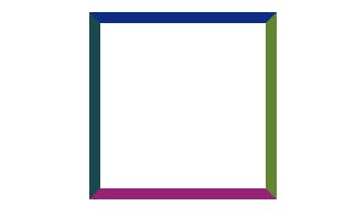
Creating triangles
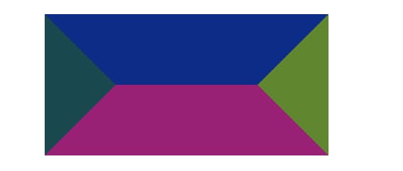
The border edges on an element are 45 degrees diagonal to each other. Notice how the border edges are slanted in the following image when you run the code below;
#triangle {
    width: 150px;
    height: 150px;
    border-top: 10px solid rgb(13, 44, 136);
    border-right: 10px solid rgb(134, 48, 120);
    border-bottom: 10px solid rgb(68, 100, 9);
    border-left: 10px solid rgb(25, 72, 78);
  }
Setting the width and height to zero and increasing the border width of the element produces the image below;
#triangle {
    width: 0px;
    height: 0px;
    border-top: 100px solid rgb(13, 44, 136);
    border-right: 100px solid rgb(97, 134, 48);
    border-bottom: 100px solid rgb(153, 33, 117);
    border-left: 100px solid rgb(25, 72, 78);
  }
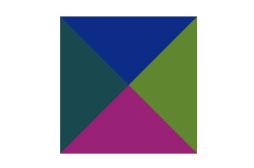
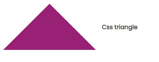
To get a full triangle, set one of the borders to a solid color and set the remaining borders to transparent and viola!! we have a triangle..Yaaaaayy!!
#triangle {
    width: 0px;
    height: 0px;
    border-right: 100px solid transparent;
    border-left: 100px solid transparent;
    border-bottom: 100px solid rgb(153, 33, 117);
  }
Creating a parallelogram
Remember how we created a rectangle? We can create a parallelogram using the same approach too. Specifying a width and height, and setting a property of transform to skew will give a parallelogram shape.
#parallelogram {
    width: 150px;
    height:150px;
    background-color: rgb(153, 33, 117);
    transform: skew(20deg);
  }

Creating a diamond shape
Creating a diamond shape might look somehow complicated, but it is actually very easy if you know how the pseudo elements (:before and :after) works. A Css pseudo-element is used to style specific parts of an element. Take a look at the div element below with four color variants, when its height is set to zero;
#diamond {
    width: 200px;
    height: 0;
    border-top: 100px solid rgb(13, 44, 136);
    border-right: 100px solid rgb(97, 134, 48);
    border-bottom: 100px solid rgb(153, 33, 117);
    border-left: 100px solid  rgb(25, 72, 78);
  }
Adding the pseudo-element :after and setting all other property to transparent will give us a diamond shape.
#diamond {
    position: relative;
    width: 100px;
    height: 0;
    border-right: 100px solid transparent;
    border-bottom: 80px solid  rgb(153, 33, 117);
    border-left: 100px solid transparent;
  }

  #diamond:after {
    content: "";
    position: absolute;
    border-top: 200px solid rgb(153, 33, 117);
    border-right: 150px solid transparent;
    border-left: 150px solid transparent;
    transform: translateX(-100px) translateY(80px);
  }
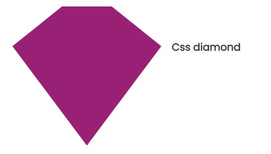
Make sure to set the position property on the pseudo element to absolute.This is done to better position the bottom part under the top part of the diamond - with a position of relative.
Creating a heart shape
Creating a heart shape basically means adding two div boxes with curved borders (top-left and top-right) together and transforming them into each other. Recall that we use the property border-radius to create curved borders - try spotting the border-radius property used in the pseudo-elements below;
#heart {
    position: relative;
    width: 200px;
    height: 160px;
 }

 #heart:before,
 #heart:after {
  position: absolute;
  content: "";
  width: 100px;
  height: 160px;
  left: 100px;
  background-color: rgb(153, 33, 117);
  border-radius: 100px 100px 0 0;
  transform: rotate(-45deg);
  transform-origin: 0 100%;
}

#heart:after {
    left: 150px;
    transform-origin: 100% 100%;
    transform: rotate(45deg);
  }

Now that we've created two shapes using the :after and :before pseudo-element. Setting the left property to zero will transform the elements into each other and form a heart, as seen;
#heart:after {
    left: 0;
    transform-origin: 100% 100%;
    transform: rotate(45deg);
  }

Creating Css shapes doesn't have to be such an uphill task. There are lots of amazing shapes you can create using css and html. However, I only discussed the basic ones here. Check out this article by css-tricks, if you wish to explore more on creating shapes using css.
Thank you for reading through, I hope that this article gave you a basic idea of how to create shapes using css. In my next article, I'll be discussing how to wrap texts around css shapes using the shape-outside and clip-path property in modern css.
Kindly give this article a like if you found it helpful :) Your feed backs and reviews would be really appreciated....stay safe friends..cheers!!